Design Challenge:
Intersecting the Old with the New
BY: PARIS BUCHANAN | JUNE 19, 2019 – 10 MIN READ

Design Challenge:
Intersecting the old with the new
BY: PARIS BUCHANAN | JUNE 19, 2019 – 10 MIN READ
I am asked frequently about brand equity. How to gain it and maintain it in an ever-changing world. We typically look to the values, stories, insights, and experiences that translate to brand equity. However, there is an aesthetic force to brand equity. The way we see objects and symbols that help us understand what a brand stands for today and in the future.
Lately, I’ve been spending much of my time helping clients rebrand themselves. Too often, designers want to throw out the old and embrace the new. The key to success in branding/rebranding is how to find the intersection of the old and the new. Everything should be up for grabs and interpretation, including logos, icons, fonts, colors, packaging, and architectural and interior design articulation.
Recently I read a quote that holds true:
“In order to plan your future wisely, it is necessary that you understand and appreciate your past.” – Jo Coudert
There are a number of recent examples of successful rebranding exercises, exciting upcoming looks, and unsuccessful attempts. Let’s take a look:
Notre Dame
This is a designer’s dream. The question is: how do you take one of the most iconic buildings in the world that has recently gone through a tragedy and refurbish it while still respecting its history?
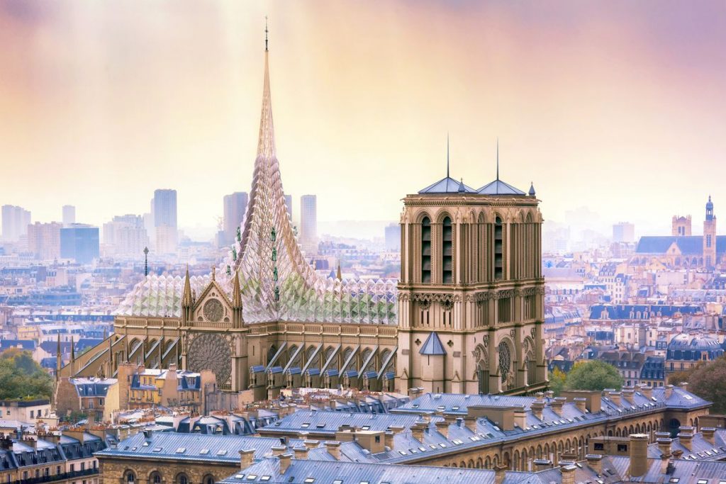
For those of you who may have been somehow in an alternate universe: On April 15th, 2019, Notre Dame became a victim to a horrible fire. The whole cathedral was not destroyed, but it had significant damage, including the always present and iconic spire. The challenge will be to embrace all of the good in this architectural brand while adding a sense of new life and hope to the Grand Dame. Although designs are still in the evaluation process, it’s exciting to witness the respect of the old structure while adding contemporary and practical flair.
There is one that is particularly impressive—architect Vincent Callebaut’s vision draws the ideas of science, art, and spirituality together. He suggests uniting the cathedral’s nave, roof, and new spire in a project he titled Palingenesis, Greek for “rebirth.” It features a garden underneath a three-dimensional crystal glass canopy. “Transparency, sharing, and openness to our society’s development: such are the ideas conveyed by this new, diaphanous forest of Notre Dame, outlining the new face of the church in the 21st century,” Callebaut explained his vision.
Burberry
A year ago, Burberry suffered an onslaught of adverse reaction to their new logo. Many believed they disrespected the history of the brand by using a font that lacked any elegance or grace. I embrace simplicity in design and am a big fan of Peter Saville. Unfortunately, this time the British designer’s extreme departure from the original font went too far. Adding further insult to injury, getting rid of the icon pushed the wrong buttons of the brand’s historians.
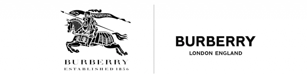
Whether you love it or hate it, the fact still remains many believe the new logo cheapened the Burberry brand. Let’s not talk about the client only giving Peter four weeks to come up with the rebrand! Peter should have said, “Hell No!”
Dunkin
New name and logo design for Dunkin. The company changed its name to highlight that they were more than just donuts — as they are mostly known for their coffee. Creating a completely new design would have been easy, but they would have sacrificed well-earned brand equity. Instead, Dunkin was smart enough to embrace history and continue with its pink and orange colors as well as the historical font.
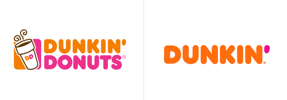
Still highly recognizable but the shortened name was enough to make the difference. The most significant change was the color change of the apostrophe from pink to orange. Everything else borders on slight but very cool changes like the positioning of the type moving to 45-degree angles at times. The packaging changed slightly to be more consistent with the rounded san serif visual language. All of this is simple and understated but does a great job of thinking through how to utilize past brand equity.
It’s easy to throw the old in the trash and come up with new. It’s much harder to embrace pieces of the past and inject life into it for the future.
Paris Buchanan is Co-Founder and Chief Creative Officer at Antonio & Paris. She has worked on ad and design campaigns globally for such clients as Microsoft, AT&T, MINI USA, Lucent Alcatel, Evivo, Cinionic, Tenet Healthcare, DIRECTV, and La Musa Hospitality to name a few.

WRITTEN BY
Paris Buchanan
Short Bio — Paris transitioned from client-side to agency life in 1998 at Foote, Cone & Belding (FCB), where she worked with clients such as USPS, Seagate, Levi Strauss, Lucent Technologies, and 3Com on integrated campaigns. In 2003 her career took an international turn when she went to work at McCann overseeing the Microsoft account. In 2006 she joined Antonio at Pure Moxie that was rebranded in 2017 to what is now Antonio & Paris.