A Tradition of Change: Bold Colors, Bold Moves
BY: PARIS BUCHANAN | JAN 28th, 2025 – 5 MIN READ


Change isn’t just what we do—it’s who we are. At Antonio & Paris, we don’t just refresh our brand every year; we revitalize it. We take the road less traveled, embracing boldness and innovation with an attitude that says, “Why settle when you can shine?” So yes, we do change our brand colors annually. Yes, it’s a ton of work. And yes, it’s totally worth it.
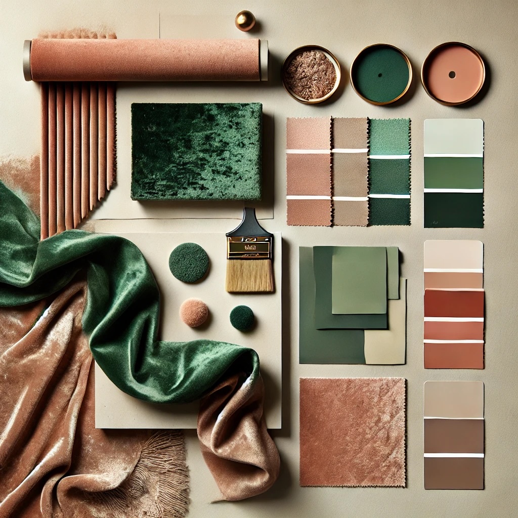
This year, we’re thrilled to unveil our 2025 color duo: Hunter Green and Peach—the perfect marriage of sophistication and sass. Mark your calendars because, on February 6, 2025, these colors officially take the stage. Hunter Green commands attention with its depth, strength, and unwavering ambition—a reflection of our resilience and drive. Peach? It’s the soft yet stunning counterpart, a calming shade that whispers openness and trust while inviting new perspectives. Together, they’re not just colors—they’re a declaration of growth, harmony, and fearless creativity.
We can’t wait for you to see these hues woven into our platforms, our storytelling, and our essence as we stride into this exciting chapter.
The Power of Color in Branding: It’s a Big Deal
Let’s get real—color in branding isn’t just about looking pretty; it’s about packing a punch, making waves, and leaving a mark. Think about the most iconic brands in the world. You don’t just see them; you feel them, and their colors are often the first thing you notice. The golden arches? Facebook blue? These aren’t just random choices—they’re power plays, calculated moves that tap into psychology, culture, and behavior to forge unforgettable connections.
 The Psychology of Color: Silent, Strong, and Strategic
Colors speak louder than words—they talk straight to the subconscious. Red screams urgency and passion (hello, clearance sales and fast food). Blue exudes calm confidence, perfect for the tech titans and financial giants. Yellow radiates positivity, and green whispers growth and sustainability.
It’s no accident that brands use these hues to shape how you feel and how you act. Color is the secret sauce behind first impressions, emotional connections, and even loyalty. It’s why your color palette can make or break how your brand is perceived.
Brand Recognition: The 80% Secret Weapon
Here’s a stat to drop at your next meeting: color boosts brand recognition by a whopping 80%. That’s right. Humans process visuals faster than text, and color is the unsung hero of visual identity. The right palette doesn’t just help you stand out in a sea of sameness; it cements you in the minds of your audience.
Think of Coca-Cola’s unapologetic red, Tiffany’s iconic robin egg blue, or Starbucks’ unmistakable green. These aren’t just colors—they’re instant connections. For startups and smaller players, nailing your color scheme could be the golden ticket to carving out a space in the big leagues.
The Cultural Side of Color: One Shade, Many Meanings
Not all colors wear the same hat across the globe. In Western cultures, white is simplicity; in parts of Asia, it’s associated with mourning. Red is the color of luck in China but signals warning elsewhere.
Going global? Your color strategy better come with a map. A misstep here isn’t just a faux pas—it’s a missed opportunity to connect with your audience authentically.
Color and Consumer Behavior: The Impulse Factor
Here’s where things get fun. Color doesn’t just catch the eye; it drives the hand. About 85% of shoppers admit that color plays a key role in their purchase decisions. Want quick sales? Go warm with red or orange. Looking for thoughtful, deliberate buyers? Cool it down with blue or green.
Whether your brand lives online, in stores, or somewhere in between, understanding how color influences behavior is a game-changer.
Crafting a Palette That Wows
Building a killer color palette is about more than picking pretty shades—it’s about crafting a vibe. Here’s how to do it:
- Know Thyself: Are you bold and rebellious or calm and polished? Your colors should scream “you.”
- Know Your People: What makes your audience tick? Find the shades that resonate with them emotionally and culturally.
- Contrast Is Key: Pair colors for impact—legibility and visual appeal matter.
- Consistency Is Queen: Once you lock in your colors, use them everywhere—logos, social media, websites, packaging, you name it.
The Bottom Line: Color Isn’t Optional
Color is the powerhouse of branding. It’s strategic, emotional, and cultural—all rolled into one. Nail your palette, and you’re not just creating a brand; you’re creating an experience, a connection, a legacy.
In this fast-moving, hyper-visual world, you don’t get second chances at first impressions. So why not make yours as bold, beautiful, and unforgettable as possible?
And remember—at Antonio & Paris, we live for the bold moves. Here’s to a year of Hunter Green, Peach, and relentless innovation. Let’s make it unforgettable.
About A&P
A&P is a brand innovation and design studio dedicated to injecting humanity into every brand interaction — igniting a love affair between brands and consumers that sparks passion, loyalty, and long-term growth. How? By keeping consumers wanting more. A&P delivers brilliant brand experiences in the physical and digital world every moment of every day.

WRITTEN BY
Paris Buchanan
Short Bio — Paris transitioned from client-side to agency life in 1998 at Foote, Cone & Belding (FCB), where she worked with clients such as USPS, Seagate, Levi Strauss, Lucent Technologies, and 3Com on integrated campaigns. In 2003 her career took an international turn when she went to work at McCann overseeing the Microsoft account. In 2006 she joined Antonio at Pure Moxie that was rebranded in 2017 to what is now Antonio & Paris.