Innovative Packaging Designs That Changed the Game
BY: ANDRÉS MATUTE | NOV 24, 2020 – 8 MIN READ

Key Takeaways (8 minute read)
- Packaging is the first impression for brands with consumer products.
- Unique, functional packaging can generate significant revenue.
- Knowing your audience and improving their customer journey is vital.
We all know it’s what’s on the inside that counts, but that doesn’t mean what’s outside should be boring. Branding consumer products means creating packaging, and while some companies prefer to go the traditional route, the major players are always looking to up their game with innovative packaging designs. Making a product stand out among the throngs of competitors or on crowded supermarket shelves is crucial for developing an outstanding brand strategy. We’re getting inspired by these brands who took their packaging design to new heights, even changing the game for their entire industry. Let’s unbox these ideas and see what made them so successful.
Keurig K-cups
Launched in 1998, Keurig set out to solve an age-old office problem: that half-pot of brewed coffee that sits there, growing colder and less 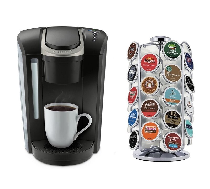 potable by the minute. Some office workers still experience PTSD from accidentally pouring a cup and taking a sip of said liquid. When the Keurig single-serve coffee pod and brewer hit the market, yuppies everywhere rejoiced. By 2002 the brand had sold over 10,000 commercial brewers. It was a few more years before the smaller, more efficient version of the machine was ready, and although competitors had jumped on the bandwagon to produce similar concepts, Keurig and its patented K-cups became the leader in the field, one cup of joe at a time. The pods themselves were the money maker and also the innovative boost that launched the brand. Although K-cups have seen their share of controversy over the years, from environmental concerns to frustrations over compatibility with other brands’ products, Keurig remains number one.
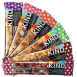
KIND Snack Bars
Searching for the most appealing nutrition bar on the shelves would be a lot easier if you could see what they actually looked like, right? Well, this was the thought at KIND when the brand introduced its new innovative packaging designs, and the transparent window in its wrappers made waves in the branding and health food industries alike. The idea was to use ingredients “you can see and pronounce,” KIND’s former senior VP of marketing, Marc de Grandpre, told The Atlantic. “This philosophy drove the design of the packaging from the very beginning as we wanted the ingredients to be the hero. That’s why KIND bars and KIND Healthy Grains Clusters both feature transparent wrapping—so you see the quality ingredients you are getting before you purchase.” With the recent announcement that Snickers plans to buy the KIND brand for a reported $5 billion, we think this success story is clear.
Vinebox
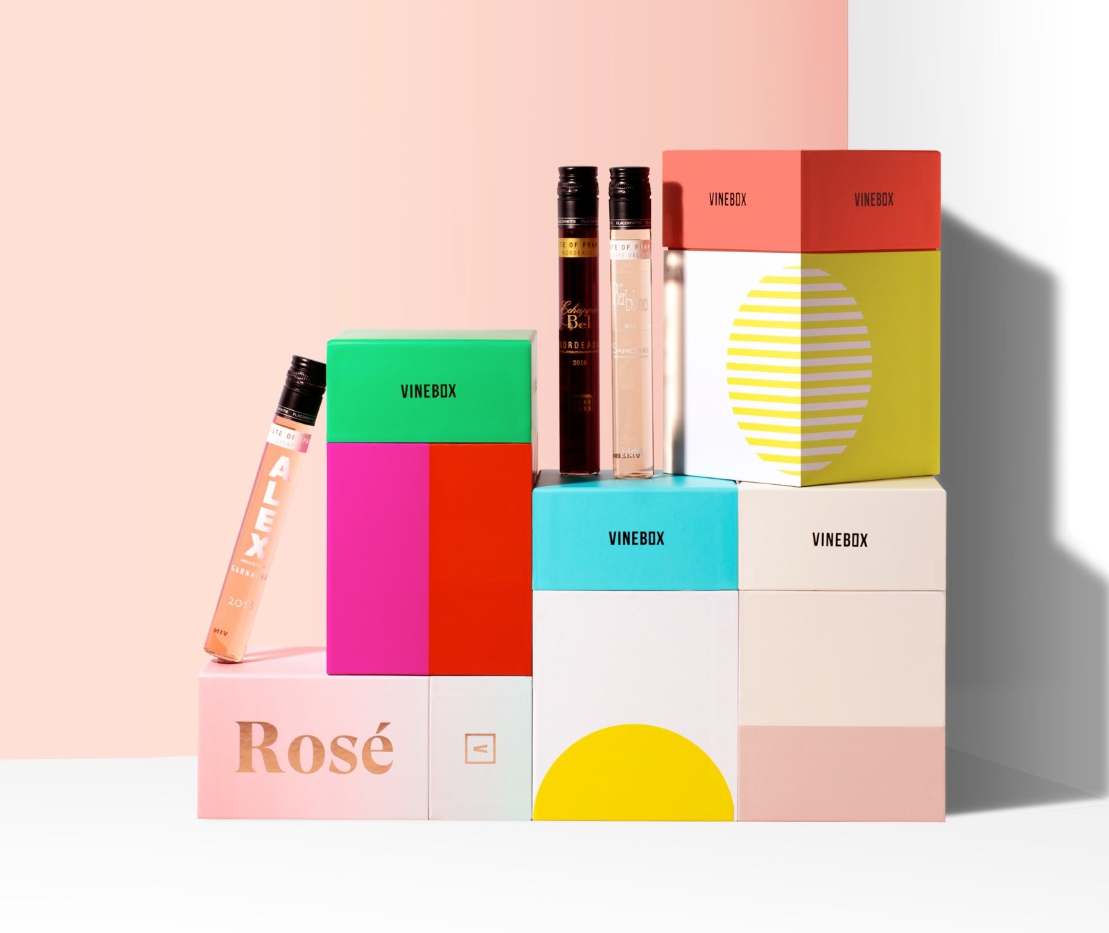 “I’ll just have one glass with dinner.” Famous last words to precede the tragic deaths of many a bottle of vino that ends up poured down the drain on a weeknight. Although its subscription wine service is intended as an at-home tasting array, Vinebox is certainly an innovator in packaging with its single-glass wine bottles. Customers can order a box of nine chic, test-tube-like bottles to try at home or—perfect for the upcoming holiday—an advent calendar pack of 12. The out-of-the-box packaging is the perfect vehicle for attracting consumers who want to learn and try more wines or those who would like to enjoy just a nightcap instead of a whole bottle. And the box containing the slim, unique bottles are just as bold and beautiful.
Coca-Cola
For a company that’s been around for over a century, Coke has made it obvious it’s keeping up with the Joneses and everyone else on the block. The beverage giant has always produced exceptional, nostalgic marketing materials that tend to have a special place in the h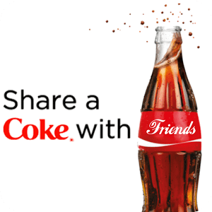 earts of its customers, but when it unveiled the “Share a Coke” campaign in 2011, it brought that personal connection into the future. Replacing the usual wrapping on its 20-ounce bottles with a variety of wrappers featuring “Share a Coke with…” followed by a name was a stroke of genius that increased value in the customer journey exponentially. Consumers were picking up bottles to find their names or, as the campaign encouraged, to find the name of a friend for whom they would buy the Coke. The designs started with 250 popular names and eventually grew to over 1,000, plus some with song lyrics and others featuring holiday destinations. It also expanded to cans, billboards, and other materials in over 80 countries. Ogilvy & Mather Sydney estimated the campaign increased the beverage’s consumption by young adults by 7 percent in Australia, where the campaign began, and increased sales in the US by 2 percent, reversing a steady decline from the previous decade. “Share a Coke” received seven awards at the Creative Effectiveness Lion Awards at Cannes in its first year.
7TRUE
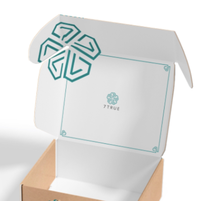 We love a package with a mission. Environmentally friendly beauty brand 7TRUE brings more than just an attractive design to the table—it’s doing good. Its seasonal nontoxic nail polish box was awarded a spot among the best subscription boxes listed by People magazine and Huffington Post in 2017. The brand was formed by three moms who hope to instill in their children and shoppers a sense of pride and love for the environment, as well as healthy habits through using nontoxic, cruelty free products. 7TRUE also gives back by choosing a charity to support with each season’s subscription box. Their products have also been featured in InStyle, NYLON, and more. Beautiful, healthy products serving a great cause? It’s a win-win.
RXBAR
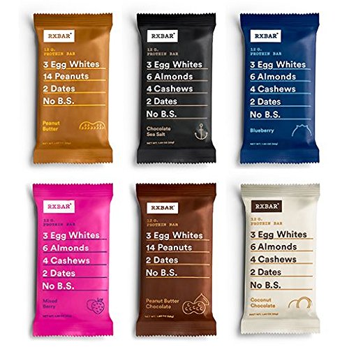 Another award winner and a direct competitor to the KIND bar mentioned above, RXBAR was always branded as “prescribed by nature,” with simple, natural ingredients that were meant to stand apart from the many health-food behemoths in the industry. The problem when the brand launched in 2013 was that, quite frankly, its packaging was ugly. A lack of creativity and some design flaws such as poor legibility no doubt hurt the company even though its product was great. So, just three years after launching, the brand underwent a major design overhaul. And what could be more disruptive in the food industry than putting your ingredients right there on the front of your product, for all the world to see? Instead of hiding them in the tiny nutrition label on the back, RXBAR cleaned up its packaging design and added lines mimicking the prescribed dosage of its ingredients—for example, its blueberry flavored package reads “3 egg whites, 6 almonds, 4 cashews, 2 dates, no B.S.” The rebrand directly led to increased sales estimated at $158 million from 2014 to 2017 and a $600 million acquisition by Kellogg.
Chobani
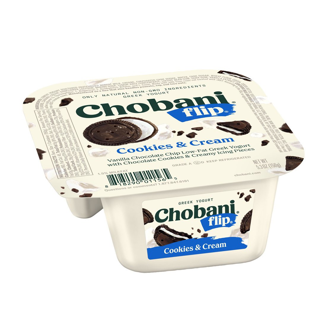 Who says packaging is just for holding the product? Chobani yogurt mastered the engineering side of its traditional plastic yogurt cups when it released the Flip design in 2013. The package features a sealed cup with two distinct sections—one for yogurt and one for a topping such as granola, chocolate chips, or fruit. The toppings “sidecar” was designed to fold over, so the consumer can easily pour it on top of their yogurt and then enjoy the perfect breakfast, treat, or late-night snack they can feel good about. Chobani Flip began with six flavors and has since expanded to more than 20. Within five years of its launch, it accounted for a third of the brand’s overall sales. Those are numbers the brand can surely flip for.
Evivo
 This infant health product developed by Evolve Biosystems was an innovator in its market long before the packaging was even conceived. As a new probiotic designed to enhance infants’ gut health, the branding has a medicinal yet soothing vibe with its muted palette of white, gray, and blue. The packaging for Evivo is contemporary, inviting, and user-friendly, from the outer box to uncommon components such as an oral syringe. The designs evoke a feeling of tranquility to enhance the customer journey, bringing comfort to a new mother, while preserving functionality of the product. The soft colors, smooth materials, and clean lines transformed the sterile medicinal feel of the products to feelings of home and wellness instead. The product got the attention of national and international press as well as the Bill and Melinda Gates Foundation, which invested $40 million in the startup.
Figlia
 If you’re a fan of the “less is more” philosophy, this limited edition hand-crafted olive oil is for you! Figlia by Agricola D’Argenio made waves at the 2020 Dieline Awards worldwide package design competition presented by Adobe when it took home Best of Show. The 300 handmade clay bottles are smooth yet irregularly shaped, each a one-of-a-kind creation in earthy, calming colors. The brand says the design celebrates “family, femininity, and the uniqueness of nature. The bottles were designed to evoke a feminine form, with each one being completely unique to reflect the beauty in individuality. Aside from a subtle stamp in the base, the bottles are purposefully left unadorned so they may be repurposed.” Playing to not only the modern consumer’s desire for unique, hand crafted luxury goods but also their value of sustainability, this design is elegant and effective all at once.
Notpla
 Speaking of sustainability, however, could it be that the most disruptive and innovative packaging design is actually no packaging at all? Notpla’s biodegradable plant-based container is intended to eliminate the harmful single-use plastics that humans are continually tossing into landfills or littering the natural environment with every single day. Developed by Skipping Rocks Lab, Notpla is an all-natural material made from seaweed and other plants. It is edible and virtually disappears after use as it breaks down within six weeks. Ideally, Notpla hopes to replace all single-use plastic pouches that are often used for condiments, along with disposable plastic cups and other plastic items. Notpla won Dieline’s Editor’s Choice for packaging design in 2020.
Which brands’ packaging do you almost love too much to open? What types of innovative packaging designs do you hope to see more of in the near future? Let us know when you connect with Antonio & Paris on LinkedIn!
About A&P
A&P, a brand agency, excels in finding innovative ways for clients to provide exceptional experiences to their customers. Their work includes consumer insight, brand innovation, creative development, mobile and technology solutions for global brands such as AT&T, Mini USA, DIRECTV, Newell Rubbermaid, Tenet Healthcare, and Barco Escape. For more information about A&P, visit them on Facebook, Twitter or antonioandparis.com.

WRITTEN BY
Andrés Matute
Short Bio — Andrés is a rebel marketer and growth enabler at Antonio & Paris. Through the years, he has been in charge of the art direction, design and brand development on projects with companies in Latin America, Europe and the United States; working with clients such as Mercedes-Benz, Adidas, MINI Cooper, AT&T, Franklin Institute, Heineken, and Copa Airlines. His healthcare experience includes the blue-chip pharmaceutical corporation Cobeca, SAAS Pharmacies, Evolve BioSystems, and Brookdale Senior Living.