The Graphic Design Revolution: Is Less Really More?
BY: PARIS BUCHANAN | SEPT 8, 2021 – 5 MIN READ

The Graphic Design Revolution: Is Less Really More?
BY: PARIS BUCHANAN | SEPT 8, 2021 – 5 MIN READ

Key Takeaways (5-minute read):
- Why are iconic brands making their new logos less detailed?
- An iconic media studio presents a great case study.
- You must be the first line of defense for your branding.
What’s in a logo? It turns out, the elaborate shading and details of branding past seem to be “too much” for the digital marketing age. The future brings sleeker, more streamlined looks even for some of the household brands we know and love best. As a result, many brands are simplifying their logo design and look to fit the digital sphere. Is this for the better, or are they devolving the years of brand equity and consumer recognition they have built up?
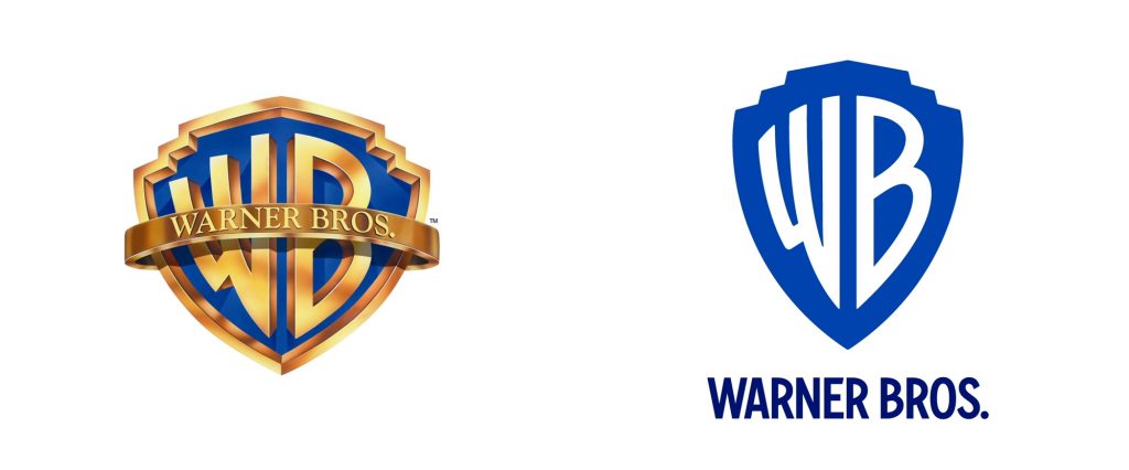
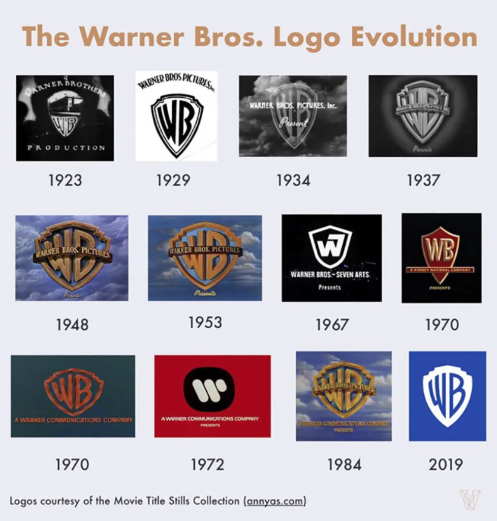
For example, in 2019, Warner Bros. Pictures made a fairly drastic swap from its iconic, elaborate golden shield logo to a sleeker, simplified blue version with the “WB” mark inside it in white. There’s no fancy “Warner Bros. Pictures” marquee crossing it and no embossed look on the basic version of this new logo. The “WB” serves as a recognizable mark, while the new wordmark below is set in a newly designed custom font inspired by the logo itself.
Why get rid of the shiny golden shield and blue-sky background that fans have come to know and love since the late-1940s?
Logo Design for Digital
A short answer is that the internet loves art but hates graphics that are too “extra.” A logo file with a lot of detail, shading, 3D, and gradients is just begging to be sized wrong and come out pixelated on the other end. The details, while evoking the legacy look and feel, also present a risk—especially if the logo is to be used in a variety of formats and locations online and/or in print collateral. Sometimes it’s just not going to translate well on the screen.
The cleaner style of the new WB logo allows it to be easily saved as an .eps or .png file with no background that designers and media partners can use on just about any marketing materials or digital channels, from websites to social media and beyond.
Image via Designboom
Preserving Brand Equity
What many fans might not know, however, is that the media giant’s new logo actually does hark back to Warner Bros. Pictures’ roots. Its logo treatments of the 1920s and ’30s are very similar, with a simple shield outline and the iconic “WB” mark fitting within it. The new branding reflects and celebrates that history as the company approaches its centennial anniversary in 2023.
The customized font has also been pulled out to use in digital marketing assets, business cards, stationery, and much more. It creates a cohesive, recognizable brand package that looks fresh for the “new era” of blockbuster film franchises and original television content WB’s fans love the most. The branding designers at Pentagram stated the new look’s purpose was “to perform across various platforms and scales, from the small spaces of the digital world to giant installations like the iconic water tower on the Warner Bros. studio lot.”
WB Animation from Pentagram on Vimeo.
Protect Your Branding
Other brands can note these advantages, but if you’re not sold on this logo “revolution,” don’t do it. Having more classic or elaborate branding just means you (or your agency) must be the very best stewards for your brand that you can be. That means creating digital logo designs in every color and style you want—white background, black background, no background; stacked, horizontal; logo mark only; et cetera. Having these files on hand for logos and any other cornerstone content that is part of your branding will ensure you are ready to provide assets when you need them for press, digital marketing opportunities, print or merchandising, office collateral, and anything else that comes up.
Having a document that outlines your brand’s guidelines is key to making sure your employees, agency, and partners maintain your brand standards at all times. This includes everything from approved colors and logo design usage to typography, spacing, sizing, and trademarks.
Rebranding can be beneficial and give your look a fresh, new feel, but it can also be scary. For some inspiration on how iconic brands have updated their looks for the digital marketing age, we’ve rounded up a few other examples:
Android
A more accessible and more mainstream look for the tech giant that started as a geared-toward-IT brand and is now the manufacturer of some of the world’s most popular smartphones and other devices.
Discovery Channel
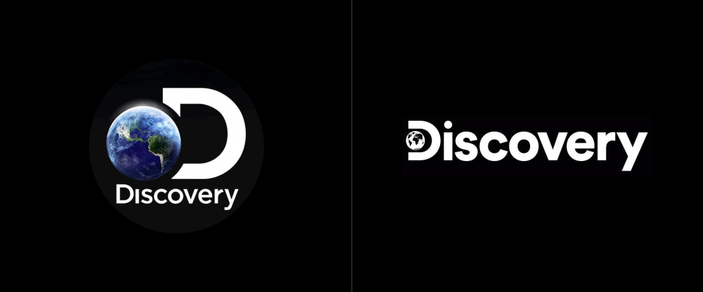
A more streamlined look with a versatile mark in the “D,” which the brand is using as a frame for images, video, and other content throughout its marketing materials.
Peugeot
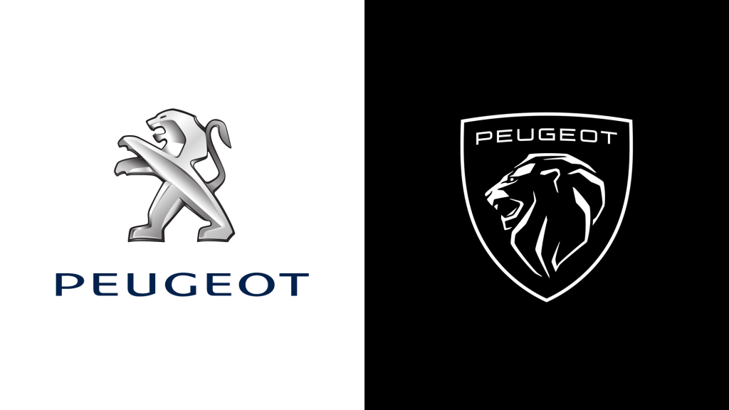
A luxury example and, like Warner Bros., another “new” logo that draws inspiration from a classic design. The look emulates Peugeot’s 1960s logo design with a cleaner typeface and sleek edges for digital marketing.
Whether you’re ready for a complete brand refresh or you’re just dipping your toes into the idea of making some changes to keep up with the times, the Antonio & Paris creative team is here to help, so get in touch!
About A&P
A&P, a brand agency, excels in finding innovative ways for clients to provide exceptional experiences to their customers. Their work includes consumer insight, brand innovation, creative development, mobile and technology solutions for global brands such as AT&T, Mini USA, DIRECTV, Newell Rubbermaid, Tenet Healthcare, and Barco Escape. For more information about A&P, visit them on Facebook, Twitter or antonioandparis.com.

WRITTEN BY
Paris Buchanan
Short Bio — Paris transitioned from client-side to agency life in 1998 at Foote, Cone & Belding (FCB), where she worked with clients such as USPS, Seagate, Levi Strauss, Lucent Technologies, and 3Com on integrated campaigns. In 2003 her career took an international turn when she went to work at McCann overseeing the Microsoft account. In 2006 she joined Antonio at Pure Moxie that was rebranded in 2017 to what is now Antonio & Paris.


